We have developed multiple advanced methods for multivariate meta-analysis and network meta-analysis, diagnosis & bias adjustment, and novel visualization.
Documentation
FUNCTIONS
Analysis
mmeta() is a unified function that conducts robust multivariate meta-analysis
nma() is a unified function for conducting network meta-analysis of continuous or binary outcomes
mnma() is a multivariate extension of nma() for multiple outcomes (e.g., efficacy and safety) network meta-analysis
Diagnosis & Bias adjustment
PB() is a unified function to test and quantify evidence of publication bias
ORB() is a unified function to test and quantify evidence of outcome reporting bias
Visualization
galaxy() is a novel visualization tool for multivariate outcomes
PLOTTING
Forest plots are used to display, on a single axis, the meta-analysis of multiple studies that test the same question using the same statistic. This statistic represents the effect size in studies, which are typically measured by the mean difference, odds ratio, risk ratio, or hazard ratio.
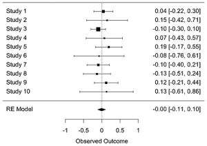 Forest plots display the values of the observed effect sizes found in the included studies using a black square, with the horizontal line through each square marking the 95% confidence interval. Each study is weighted based on its inverse variance and indicated by the size of the squares in the forest plot. The dotted vertical line, known as the “line of null effect”, represents the case of no difference between the treatment and control interventions while the black diamond at the bottom of the “forest” marks the combined average outcome size for all of the studies.
# Forest plot

nstudy=10
se=y=NULL
set.seed(1234)
for (istudy in 1:nstudy) {
  se=c(se, runif(1, 0.1, 0.4))
  y=c(y, rnorm(1, sd=se))
}

random = rma(y, sei=se)
forest(random)
Funnel plots are a graphical representation of the observed intervention effects, plotted on the x-axis, against each study’s size or precision, plotted on the y-axis. This type of plot forms a funnel shape in the absence of bias. The funnel shape occurs because as the study size increases, the precision of each study’s effect estimates also increases; larger studies thus have a lower standard error and are closer to the true effect estimate. Smaller studies may have more widely spread effect estimates due to their higher variability, which scatter at the base of the funnel plot.
Funnel Plots
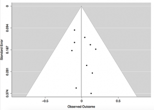 Each study is represented by a dot of equal size and plotted according to the observed outcome and corresponding standard error. The solid vertical line indicates the average effect size among the included studies and the dotted diagonal lines forming the funnel shape serve as the 95% CI for the aggregated studies.
# Funnel plot

nstudy=10
se=y=NULL
set.seed(1234)
  for (istudy in 1:nstudy) {
  se=c(se, runif(1, 0.1, 0.4))
  y=c(y, rnorm(1, sd=se))
}

random = rma(y, sei=se)
funnel(random)
Contour Enhanced Funnel Plot
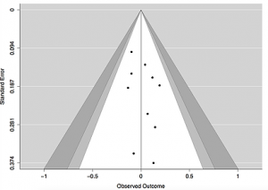 The contour enhanced funnel plot depicts the same information from the included studies as the simple funnel plot, but has additional shaded areas which represent different confidence intervals. In the example, the white region of the funnel corresponds with the 90% CI, the white and light gray regions correspond with the 95% CI, and the white, light gray, and dark gray regions correspond with the 99% CI, though these levels of confidence may be adjusted in the R code.
# Contour enhanced funnel plot

nstudy=10
se=y=NULL
set.seed(1234)
  for (istudy in 1:nstudy) {
  se=c(se, runif(1, 0.1, 0.4))
  y=c(y, rnorm(1, sd=se))
}

random = rma(y, sei=se)
funnel(random,
  level=c(90, 95, 99),
  shade=c("white", "gray", "darkgray"),
  refline=0
)
Network meta-analysis compares multiple interventions simultaneously by analyzing studies making different comparisons in the same analysis.

data(Senn2013)

# Generation of an object of class 'netmeta' with reference
# treatment 'plac'
#
net1 <- netmeta(TE, seTE, treat1, treat2, studlab,
                data = Senn2013, sm = "MD", reference = "plac")

# Network graph with default settings
#
netgraph(net1)
The SROC, or summary receiver operating characteristic, curve relates the between-study heterogeneity and the sensitivity and specificity of diagnostic test studies, where specificity is measured on the x-axis while sensitivity is measured on the y-axis. A regular ROC curve plots the relationship between the false positive rate, or when specificity is 1, and the true positive rate, when sensitivity is 1.
The SROC curve plots the specificity and sensitivity from each study in the ROC space to observe the threshold effect in diagnostic studies. The specificity-sensitivity pairs from each study are represented by dots, whose size depends on the size of the study. The line passing through these points, or the SROC curve, is the line of best fit while the dotted 45 degree line is an indicator for the case of complete randomness. The more the dots gravitate toward the top left corner, the better is the sensitivity or true positive rate.

The cross-hair plots show the individual studies in ROC space with paired confidence intervals representing sensitivity and specificity.

library(mada)
data("AuditC")
rs <- rowSums(AuditC)
weights <- 4 * rs / max(rs)
crosshair(AuditC, xlim = c(0,0.6), ylim = c(0.4,1),col = 1:14, lwd = weights)
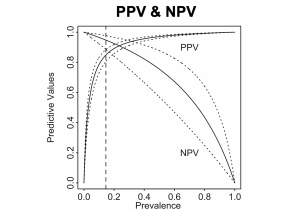 This PPV & NPV plot jointly display the positive predictive value and the negative predictive value. In this figure, the solid curves are the PPV and NPV; the dotted curves represent the 95% confidence interval. The vertical dashed line is usually used to present a specific prevalence.
####### plots function
ppv.npv.plot.func <- function(fit, title, prev_ttp){
###### prevalence
prev<-c(0, seq(0.0005, 0.9995, 0.0005), 1)

# mmeta method results
mu0 = fit$coefficients[1] # sensitivity
nu0 = fit$coefficients[3] # specificity
covt = fit$vcov[c(1,3), c(1,3)]

# ppv
ppv <- prev * expit(mu0) / (prev * expit(mu0) + (1-prev)*(1-expit(nu0)))

# npv
npv <- (1-prev) * expit(nu0) / ((1-prev) * expit(nu0) + prev*(1-expit(mu0)))

# LRP <-mu0-log(1+exp(mu0))-nu0+log(1+exp(nu0))
temp <-matrix(c(1-exp(mu0)/(1+exp(mu0)), -1+exp(nu0)/(1+exp(nu0))), nrow=1)
std.logLRP<-sqrt(temp%*%covt[1:2, 1:2]%*%t(temp))
ppvCI.upper <- expit(logit(ppv)+qnorm(0.975)*as.numeric(std.logLRP))
ppvCI.lower <- expit(logit(ppv)-qnorm(0.975)*as.numeric(std.logLRP))

temp<-matrix(c(-exp(mu0)/(1+exp(mu0)), -exp(nu0)/(1+exp(nu0))), nrow=1)
std.logLRN <- sqrt(temp%*%covt[1:2, 1:2]%*%t(temp))
npvCI.upper <- expit(logit(npv)+qnorm(0.975)*as.numeric(std.logLRN))
npvCI.lower <- expit(logit(npv)-qnorm(0.975)*as.numeric(std.logLRN))

###### values at prev_ttp
index = which(round(prev,4) == prev_ttp)
### ppv
ppv_list = round(c(ppv[index],
ppvCI.lower[index],
ppvCI.upper[index]),2)
### npv
npv_list = round(c(npv[index],
npvCI.lower[index],
npvCI.upper[index]),2)

###### plot
plot(prev,ppv, type="l", xlab="Prevalence", ylab="Predictive Values",
xlim=c(0, 1), ylim=c(0, 1), xaxs="r", yaxs="r", lwd=1,cex=0.8, col = "red")
lines(prev, npv, lty=1, col = "blue")
lines(prev, ppvCI.upper, lty=3, col = "red")
lines(prev, ppvCI.lower, lty=3, col = "red")
lines(prev, npvCI.upper, lty=3, col = "blue")
lines(prev, npvCI.lower, lty=3, col = "blue")
text(0.15, 0.92, "NPV", col = "blue")
text(0.15, 0.20, "PPV", col = "red")
abline(v=prev_ttp, lty=2, lwd=2)
axis(side = 1, at = prev_ttp)
title(title)
text(0.55, 0.32, paste("When prevalence is 0.35 \nPPV = ",
ppv_list[1]," (",ppv_list[2],",",ppv_list[3],")",
"\nNPV = ",
npv_list[1]," (",npv_list[2],",",npv_list[3],")",
sep = ""))
#### specific values
dt_ppv = rbind(prev, ppv, ppvCI.lower, ppvCI.upper)
dt_npv = rbind(prev, npv, npvCI.lower, npvCI.upper)
# list = round(seq(0.09, 1, by = 0.05),4)
list = round(seq(0.10, 0.90, by = 0.10),4)
prev_round = round(prev, 4)
dt_ppv_list = round(dt_ppv[,prev_round %in% list],2)
dt_npv_list = round(dt_npv[,prev_round %in% list],2)


return(list(ppv_list = ppv_list,
npv_list = npv_list,
dt_ppv_list = dt_ppv_list,
dt_npv_list = dt_npv_list))
}

This plot is used to present the estimated sensitivity or specificity with summary points and corresponding confidence region.
A Visualization Tool for Bivariate Meta-Analysis

As an example, the top panel plots the posterior distributions for the log-odds ratio of developing lung cancer. The blue dashed line is log odds ratio for risk of lung cancer before bias correction; the red solid one is after bias correction.
In the bottom panel, the posterior distributions for the mean improvement in depression symptoms is plotted before and after bias correction.